
Lay's Embraces a Healthier Future with Major Rebrand
Introduction
On October 10, 2025, Lay’s, the iconic potato chip brand under PepsiCo, announced a major rebrand, marking its largest redesign in nearly a century. This includes a fresh logo, revamped packaging, and a commitment to healthier ingredients, aligning with broader health trends and initiatives like "Make America Healthy Again." The changes reflect Lay’s desire to modernize its identity while appealing to health-conscious consumers.
By the end of 2025, Lay's products within the US will no longer be made with artificial flavors or colors https://t.co/B5BzOLyTJt
— Dexerto (@Dexerto) October 10, 2025
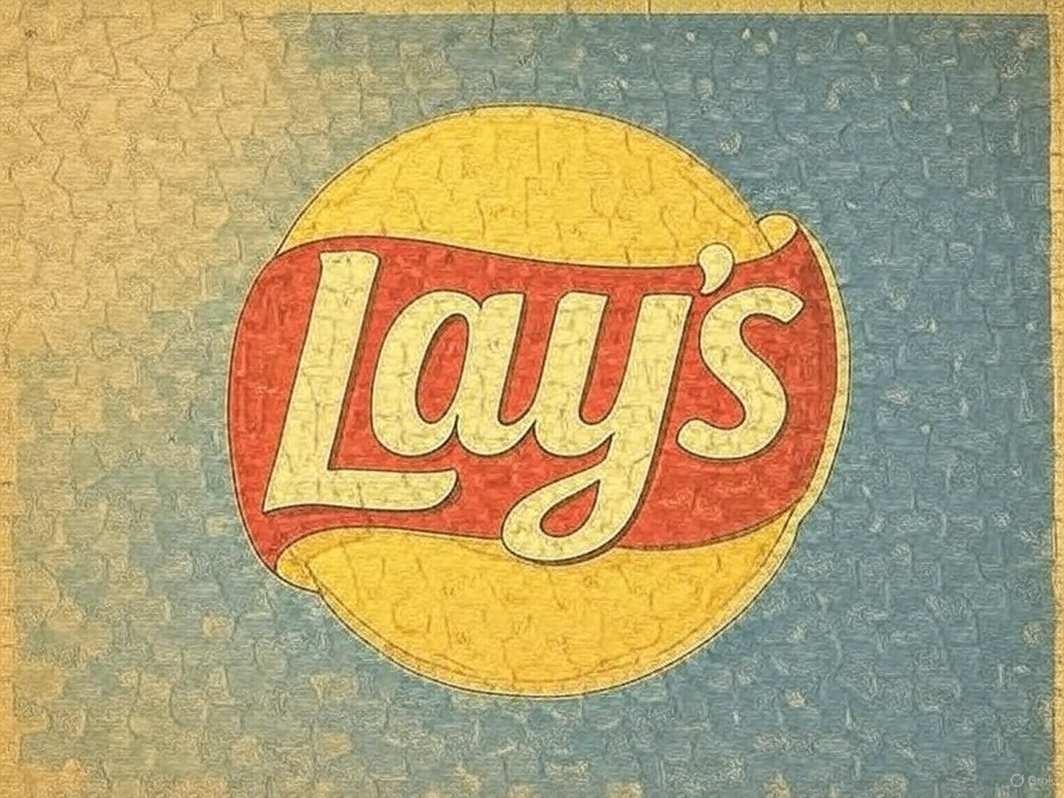
1. The New Logo: A Sunny Refresh
Lay’s introduced a brighter, warmer logo featuring sun rays dubbed “Lay’s Rays.” This design nods to the sunlight that grows potatoes, symbolizing natural ingredients. PepsiCo calls it the brand’s “largest redesign,” merging heritage with a vibrant, modern look. Over the years, Lay’s has adjusted its logo multiple times, but this update is historic.
2. Packaging Overhaul: Farm-Fresh Focus
The new packaging replaces bold red with subtle, earthy tones inspired by potatoes and farms. Key updates include:
- Prominent brand name: “Lay’s” is instantly recognizable.
- Matte finish: Adds a modern, premium feel.
- Custom fonts: Enhances readability and brand personality.
- Potato-centric visuals: Highlights farm-fresh ingredients.
Brand strategist Laura Burkemper called the redesign a “masterclass in visual storytelling,” designed to catch the eye on crowded shelves.
3. Healthier Chips: Removing Artificial Additives
Lay’s is making its products healthier without compromising flavor:
- Elimination of artificial colors and flavors in all US products by the end of 2025.
- Lay’s Baked chips: Now made with olive oil and 50% less fat.
- Kettle Cooked Reduced Fat Original Sea Salt: Made with avocado oil.
These changes aim to meet growing consumer demand for natural, cleaner-label snacks.
4. Rollout and Motivation Behind the Rebrand
The updated logo and packaging debuted in October 2025, with full US implementation by the end of the year. PepsiCo’s goal is to highlight Lay’s healthier side while keeping its traditional fan base engaged. The move mirrors a wider trend, with brands like Domino’s adopting minimalist designs to appeal to modern audiences.
5. Public Reaction: Mixed but Buzzing
Social media reactions have been lively:
- Skeptical: @chiefflips asked, “What’s a 'healthier' version of potato chips?”
- Humorous: @borutaura696611 joked, “Healthier = more thin and less chips.”
- Positive: @AstralAlexys shared, “Lowkey don’t hate it.”
With thousands of engagements on X (formerly Twitter), the rebrand has sparked conversation and anticipation.
FAQs
Q1: When will Lay's new recipes be available?
By the end of 2025, all US Lay’s chips will feature healthier ingredients without artificial flavors or colors.
Q2: Will the taste change with the healthier ingredients?
Lay’s assures fans the signature crispiness and flavor remain intact, despite the healthier oils and reduced additives.
Q3: Is this rebrand global?
Currently, the focus is on the US market, though international changes may follow.
Conclusion: A Crunchy Leap Into Health and Heritage
Lay’s bold rebrand is more than a cosmetic refresh—it’s a strategic move balancing heritage, health trends, and visual appeal. By eliminating artificial additives and emphasizing farm-fresh imagery, Lay’s is positioning itself as both a nostalgic favorite and a modern, health-conscious choice. While some fans remain skeptical, the combination of a sunlit logo, premium packaging, and cleaner ingredients could redefine what Americans expect from snack foods. The snack aisle, as a result, may never look—or taste—the same again.
0 comments