
Long John Silver’s Surprises Fans with Chicken Logo & New Menu
Introduction
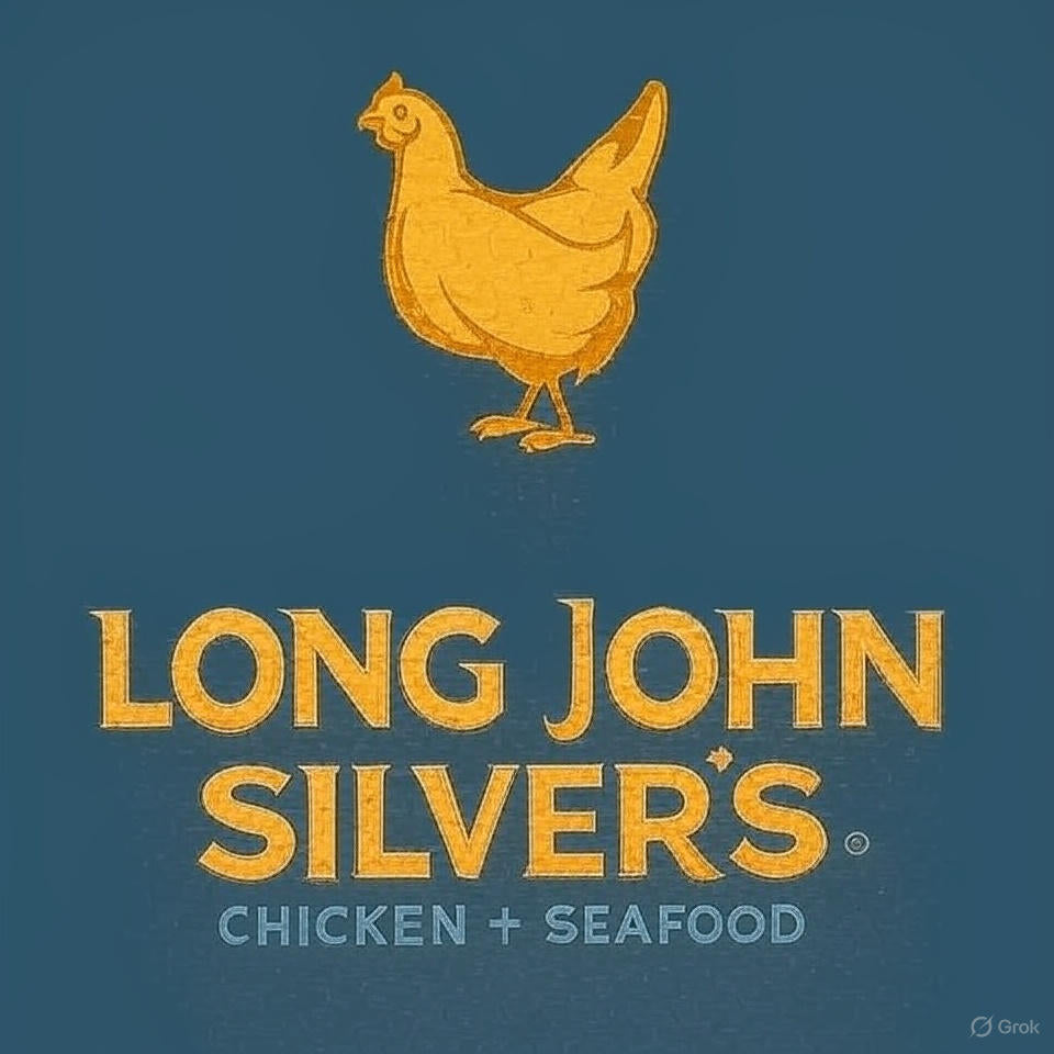
Long John Silver’s, the iconic American fast-food chain known for its seafood, has taken a bold turn. On October 3, 2025, the company unveiled a new logo replacing its classic fish emblem with a stylized chicken, putting its “best kept secret”—hand-battered chicken planks—into the spotlight. The move has sparked curiosity, debate, and excitement across social media.
The new logo is aimed at highlighting the chains 'best kept secret'
— Dexerto (@Dexerto) October 11, 2025
More info: https://t.co/65uLCWO5qk
The Reason Behind the Logo Change
Christopher Caudill, Long John Silver’s marketing executive, explained that the rebrand is designed to highlight the chain’s chicken offerings, which have long been praised but overshadowed by seafood items.
"Guests have been telling us for years that our chicken is a best-kept secret. Our hand-battered chicken strips—known as Chicken Planks—are every bit as crave-worthy as our legendary fish. It’s time we let that secret out."
While seafood remains at the heart of the brand, this logo shift signals an effort to diversify the menu and attract new customers, reflecting broader trends in the fast-food industry.
New Menu Innovations
Alongside the logo refresh, Long John Silver’s is testing several chicken-centric dishes:
- Spicy Nashville Hot Chicken – A fiery, hand-battered take on classic chicken.
- Seafood & Chicken Wraps – Combining signature Crumblies, sauces, and tender chicken in a portable wrap.
These menu innovations aim to balance seafood heritage with new chicken options, catering to both loyal fans and curious diners.
Public Reaction & Social Media Buzz
The rebrand quickly went viral on X (formerly Twitter), generating mixed reactions:
- Humor & Jokes: "Should have used a penguin instead. Penguins are a little bit of both."
- Skepticism: "Why? That’s literally so stupid, the chicken makes no sense."
- Praise: "Their chicken tenders were always better anyways."
The announcement garnered thousands of likes and hundreds of comments, highlighting the strong public interest and potential impact on the brand’s identity.
FAQs About the Rebrand
- Is seafood still available at Long John Silver’s?
- Yes, seafood remains a core part of the menu and brand identity.
- When was the new chicken logo introduced?
- October 3, 2025.
- What are Chicken Planks?
- Hand-battered chicken strips that have become a customer favorite, now featured in the new logo and menu items.
- Are there new menu items besides chicken planks?
- Yes, including Spicy Nashville Hot Chicken and Seafood & Chicken Wraps.
- Will the company revert to its old fish logo?
- Currently, there are no plans to revert. The rebrand aims to evolve the brand while keeping seafood in its DNA.
Looking Ahead: Intellectual Takeaway
The Long John Silver’s rebrand is more than a logo change—it represents a strategic pivot toward diversification and innovation. Fast-food brands face the challenge of staying relevant while honoring their heritage. By emphasizing chicken, Long John Silver’s is not abandoning its roots but rather experimenting with hybrid offerings to appeal to broader audiences.
This bold move raises an important discussion in brand management: Can a legacy brand reinvent itself without alienating loyal customers? Early indicators suggest curiosity outweighs backlash, but sustained success will depend on execution, menu quality, and customer perception. Observing Long John Silver’s journey may offer valuable lessons for other established chains navigating the delicate balance between tradition and evolution.
0 comments